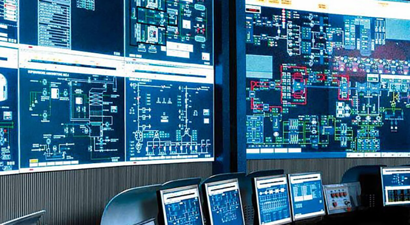
As automation technology has evolved, so has the ability to create faster graphical interface with equipment. However, one component of that interface that may have been left behind is screen design.
A recent white paper by Schneider Electric suggests there are now ways to reduce the time it takes programmers to design effective HMI screens that still promote flexibility of use and better interface with the machines they are interacting with.
Before the advent of screen design software, it used to take a significant amount of programming knowledge and skill to design an HMI screen that was both effective and user-friendly. However, that changed when screen tags came of age allowing programmers to use special commands to somewhat speed up the ability to set up screens, but it was still cumbersome and required a good amount of effort and ability.
With Windows™, HMI screen design was able to change more fluidly and with even more ease than before. It eliminated the need to use screen tags, but other components such as part placement and attribute changing were still part of the process, making HMI design just as time-consuming as before.
But, as with many things technology-driven, today has brought about a new ability to simplify the process of screen design by automating and, in some cases, eliminating, most steps so that the process becomes simpler and less of an inefficient process. In the table below, Schneider Electric outlines the evolution of HMI design over the years:

In Schneider’s study, they found that the number of base screens on a large HMI can number more than 500 and the number of parts per screen can exceed 100 making the time spent on designing an HMI screen seem a bit excessive.
They found that more than 70 percent of HMI designers are still using scripts to design and that the “pain points” for customers in HMI design was developing customized features by 41 percent. Additionally, cost reduction is no longer the main motivator for product differentiation. Because new technology has brought smartphones and tablets into the marketplace, customers are demanding better usability and performance/throughput as their primary important factors.

Before, to create HMI design, you drew parts on base screens and the resolution on those base screens needed to match the resolution on the HMI. You have absolute values (X and Y coordinates) that work against the screen resolution. This means, if you want to change any screen data on another unit with a different resolution, you would have to readjust the position of every part. You also could not simply change the position of the parts on the original screen, which means you wouldn’t have a lot of freedom to change the layout the way you want to.
But now that has changed. HMI 4.0 allows screen design different from the base screen that has no dependence on the base screen.
You can now use a grid layout with rows and columns like a table. If you draw a part on the screen, you drop the part into a cell and the part automatically sizes to the cell area. The size of the rows and columns are relative to the screen resolution. That means, if the screen resolution changes, the rows and columns will change accordingly.


